Melburnians are obsessed with weather. More accurately, we are obsessed with predicting the weather. Of course it’s a national joke that we can have four seasons in one day, but we don’t mind that as long as we can tell when those seasons will fall. Our chief tool in this quest, is the venerable BOM – the Bureau of Meteorology website.
 The buzz among Melbourne’s weather nerds this morning is the change of format on the forecast pages. It’s gone from the old ‘typerwriter’ format to a newly styled html format and I have to ask… why?
OK, I’m not questioning why you would change, there are benefits to structuring html instead of the old ‘blob’ of text. Well structured html can enable all sorts of wonderful trickery – especially when it’s data related. The more granular and identifiable the pieces of data, the more useful they become. Of course, along with well structured html comes the opportunity to introduce richer and more meaningful style. So there are two really compelling reasons why this move by the BOM might have been a good idea. Unfortunately, and mysteriously, they’ve missed both opportunities!
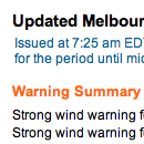
I don’t want to get too long winded with this, but let’s start with a simple example of what they could have done and completely missed… warnings. There is a section at the top of the page, which lists current warnings. The heading has been given a class of ‘warning’, but the paragraphs that follow are simply styled with a class of ‘sl’ – a generic class that has been used repeatedly all over the page. So, if I wanted to create a tool that automatically extracted warning information from this page, I could easily look for the ‘warning’ heading, but determining how much of what followed was the text of the warning would be much harder and involve a degree of guesswork. Compare this with how I think it should have been done: a div of id=’warnings’ containing a heading and an unordered list. Easy to identify on the page, simple to extract the information, easy to target with styles. This sort of problem is repeated throughout the page. Such a shame to see a rich source of information such as this wasted by poorly structured data.
So, we’ve established there are problems with the html, but there is still a fair bit of scope in the new structure for styling it reasonably to at least make it easy to read on screen. So what did they do? It seems as though they have attempted to make the new html look as much as possible like the old teletype. It’s horrible! They could have used size, font, indents – all sorts of typographic devices – to break this information into more easily digested visual bites, but no, we have a slab of ‘monotext’. It lacks variety, relief, hierarchy and interest. I think, if anything, it’s harder to read than the old format. Don’t believe me? Take a look at the ‘Around Melbourne’ section – where the forecast maximum temperature for Frankston is actually closer on the page to the word ‘Geelong’ with no visual clues as to which is related to which. OK, our logic tells us that the temp follows the name, but a page shouldn’t be relying on the user’s knowledge of data structures in order to get it’s message across.
I’ve said enough – it’s a good example of a badly done redevelopment – shame!
I hadn’t noticed. The link in my bookmarks still shows the old, familiar typewriter look…